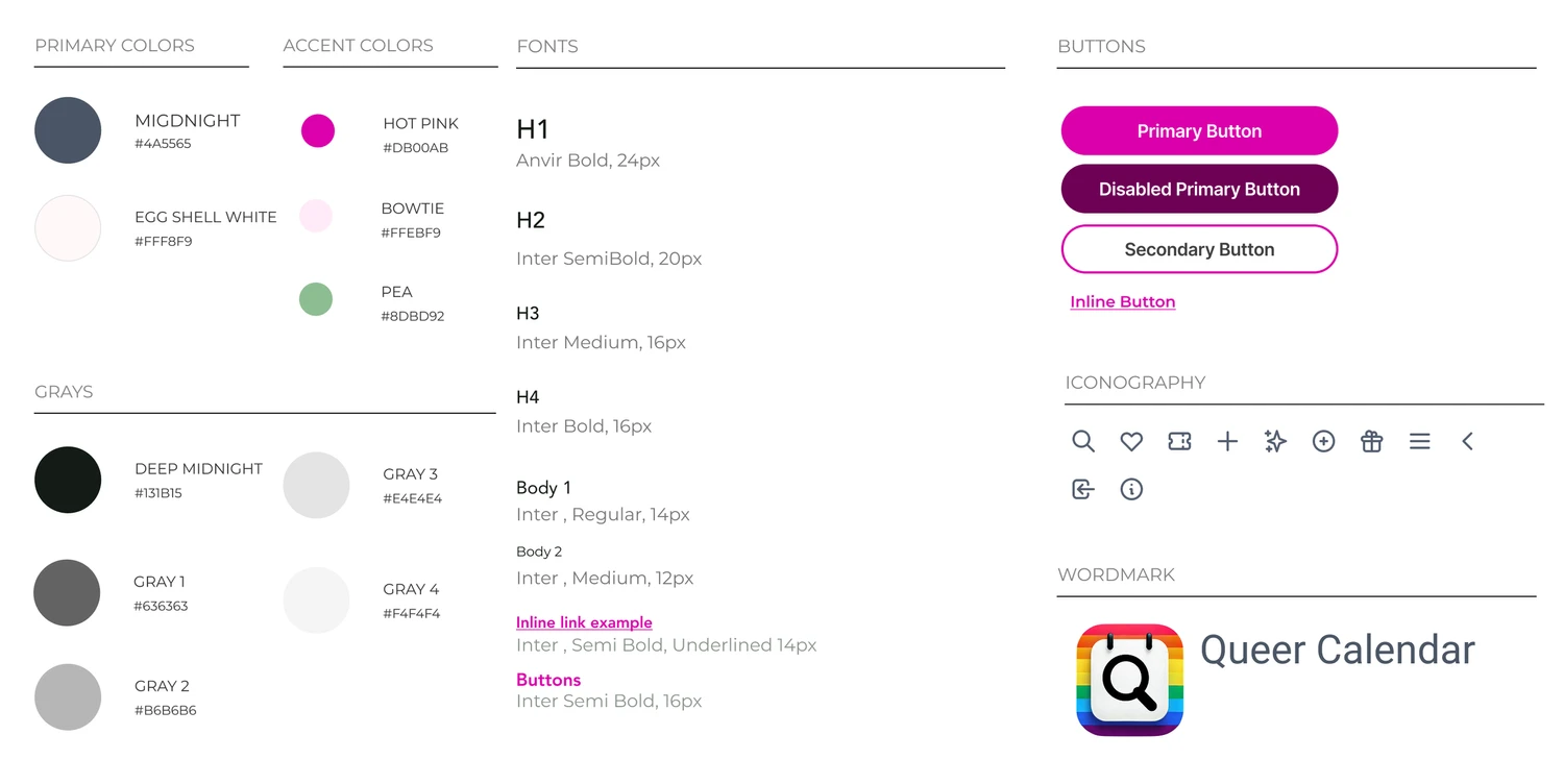
Queer Calendar
Product design for a B2C event discovery platform, centered on inclusive UX for the LGBTQ+ community.

Project Overview
Project Type: Event Discovery Platform
Product: SaaS platform for Mobile & Web
Role: UX/UI Designer
Timeline: February 2025 - June 2025 (5 months)
Platform: iOS/Android, Web
Tools: Figma, FigJam, Miro, Whimsical
Queer Calendar is an event discovery platform designed to help LGBTQ+ individuals easily find inclusive, affirming events in their local communities. The project aimed to address a gap in existing event platforms, which often lack identity-aware filtering, safety signals, and community-centered design.
The Problem:
Many LGBTQ+ individuals struggle to find events that feel both relevant and safe.
Mainstream event platforms prioritize scale over inclusivity, making it difficult for users to:
Discover events tailored to their identities
Assess whether spaces are truly affirming
Find community beyond nightlife-focused experiences
User + Business Tension:
Users want an easy way to discover inclusive events they can trust, while organizers need a platform that authentically reaches LGBTQ+ audiences without requiring extensive marketing resources.
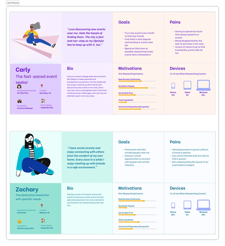
The Research & Insights
To understand the needs of LGBTQ+ community members, I used user personas and conducted secondary research which allowed me to analyze patterns from existing platforms and community feedback.
Key Insights
Users want identity-based filtering without feeling “boxed in”
Safety and inclusivity signals matter more than event popularity
Community-centered language builds trust faster than generic event listings
Many users discover queer events through word-of-mouth due to a lack of centralized platforms
These insights shaped both the feature set and tone of the platform.
The Solution:
A curated event discovery platform that centers inclusivity, accessibility, and trust.
The founder and I designed Queer Calendar, a curated event discovery platform that centers inclusivity, accessibility, and trust.
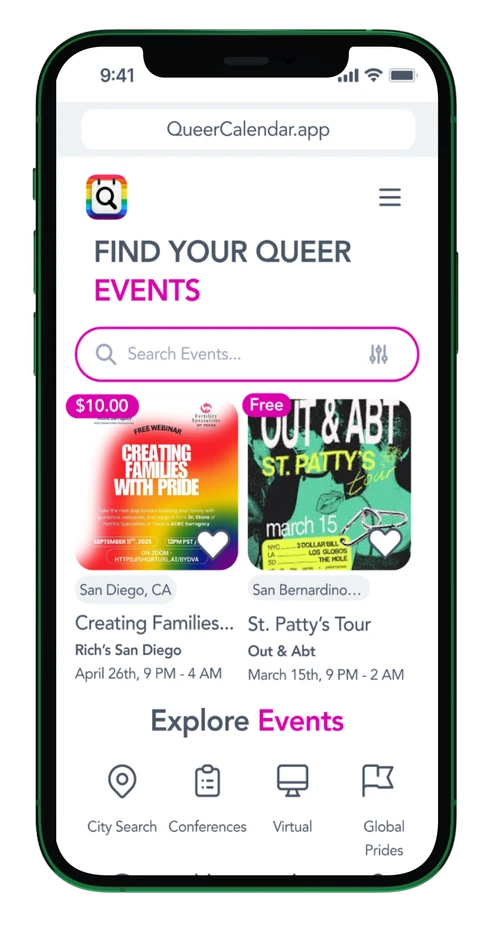
Core Features
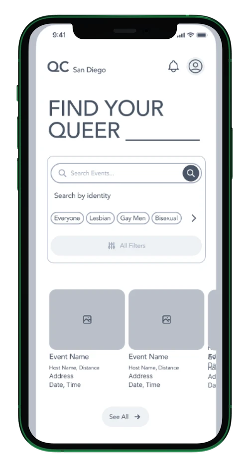
Identity-Based Filtering
Users can filter events by identity, interest, location, and more
Filters are optional and flexible, allowing self-expression without forcing labels
Event Discovery & Curation
Events are curated to ensure inclusivity and relevance
Clear event descriptions and tags help users quickly assess fit
Organizer Tools
Event submission flow designed to be quick and approachable
Encourages grassroots organizers to share events without friction
Accessibility & Safety Signals
Visual cues and language that communicate affirming spaces
Clear information about accessibility, pricing, and location
The Process
Information Architecture (Primary Challenge)
One of the most challenging aspects of designing Queer Calendar was mapping a site structure that supported two distinct user groups:
Users who needed an intuitive way to discover inclusive events
Admins / Organizers who needed tools to create and manage events and performer pages
Each group had different goals, mental models, and entry points into the platform.
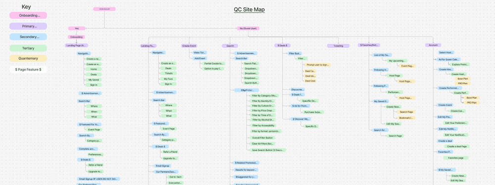
Early site map iterations struggled to balance these needs. Some versions over-prioritized event discovery, making creation tools feel hidden or confusing. Others surfaced admin functionality too early, cluttering the user experience and increasing cognitive load for first-time visitors.
It took several rounds of site mapping and flow iteration to clearly separate the user and admin experiences while still keeping them cohesive.
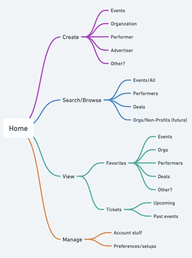
Flow Iteration & Refinement
Designing the correct flow required stepping back from screens and focusing on systems.
Key questions I revisited across iterations:
When should users encounter filters vs. browsing experiences?
How do admins transition from discovering events to creating them?
Where do performer pages live within the ecosystem?
How can creation tools feel accessible without dominating the primary user experience?
The introduction of performer pages added a layer of complexity, requiring the platform to support:
Individual performer discovery
Performer-to-event relationships
Admin-level creation and editing flows
Each iteration revealed friction points and informed adjustments to navigation, hierarchy, and access controls.
Only after arriving at a flow that felt intuitive for both users and admins did visual design begin.
Wireframing
Once the core structure was resolved, I moved into low-fidelity wireframes to validate layout and hierarchy across both user experiences.
Wireframes were used to test:
Clear separation between discovery and creation flows
Admin access points that felt available but unobtrusive
Event and performer page structures that scaled across use cases
Because the underlying architecture had already gone through multiple iterations, wireframing focused on refinement rather than structural rework.
Visual Design
Visual design began only after both user and admin flows felt resolved. The UI was designed to:
Prioritize clarity and ease of discovery for users
Make event and performer creation feel approachable for admins
Maintain a cohesive visual language across both experiences
By grounding the interface in a well-considered information architecture, the final design supported complexity without feeling overwhelming.
Key Learnings & Reflections
Designing for multiple user groups reinforced the importance of solving structure before aesthetics.
Supporting both event discovery and event creation within the same product required:
Intentional separation of concerns
Thoughtful navigation decisions
Iterative validation of flows
This project highlighted that the hardest UX problems often live beneath the interface and that taking the time to resolve them leads to more confident, scalable design decisions.
Thank you for reading!
Copyrights 2026 — All rights reserved